I could summarize the remarkable 7-day run of temperatures during the first week of September or the push of smoke into northern Utah to add insult to injury, but let's talk about something positive for once.
This week, I finished what I'll call phase one of upgrades to the graphics on weather.utah.edu. This has been a heavy lift. Many of the graphics on weather.utah.edu were produced by software I developed in 2002–2003, especially those for plotting the HRRR, NAM, and GFS. Back then, I wasn't an old manager like I am today. I could still code (using the languages of the time). To do this most recent upgrade, I had to basically learn to code again, this time in Python, dealing with all of the ugliness of meteorological data formats, kludgy python functions, and multiprocessing.
As is often the case, now that I'm done, I could probably rewrite everything much more succinctly and efficiently, but it's now good enough for government work.
The HRRR and GFS-13-km products were updated and expanded over the summer, so this most recent upgrade involved updating the products generated from the GFS quarter degree grids (the 13-km GFS grid has a limited number of variables precluding use for many diagnostics). I've designed these products mainly for teaching synoptic meteorology, but they can be useful for forecasting. Below is a somewhat techy summary of the products now available under the GFS-0p25deg tab in the left-hand navigation bar.
Synoptic Diagnostic
This is a four-panel plots that includes basic synoptic-scale fields.
Upper left: 500-mb heights, 500-mb absolute vorticity, and 750-mb vertical motion. The latter is smoothed to remove smaller-scale waves (known as gravity waves) and illustrate the large-scale vertical motion important for the development and decay of cyclones and large-scale precipitation systems.
Upper-right: Sea-level pressure, 925-mb temperature, a proxy for infrared satellite imagery, and 3-h accumulated precipitation. The 925-mb temperature is for about 750-m above sea level (extrapolated below ground over the west) and good for illustrating the location of fronts, especially over oceanic areas.
Lower left: 700-mb RH, wind, and temperatures. The 700-mb level is widely used for forecasting in the interior western U.S. as it is near mountaintop level, although I'm using it for plots in all regions.
Lower right: Integrated vapor transport magnitude (color fille) and vectors. I'm pretty excited about this product as I've wanted something better than what is available elsewhere on the web which often does not properly account for topography in the IVT calculation (I'll avoid the details). This does. In the above plot, you can clearly see the effects of Tropical Storm Kay over SoCal.
The synoptic diagnostic is available for the "Supernational West" (a big view of the western Continental United States), Supernational Central, Supernational East, western Continental US, Intermountain West, Europe, Greater Alpine region, Japan, and South America. Yes, you know why some of those are there.
DT and Surface Diagnostic
This is a two-panel diagnostic designed for teaching concepts in large-scale dynamic meteorology.
Top Panel: This is an analysis of potential temperature, wind vectors and wind speed on the dynamic tropopause, or DT for short. The DT separates the troposphere (or lower 80% or so of the atmosphere) from the much more stable stratosphere. These maps are extremely useful for understanding the jet-level flow (the jet stream is usually strongest at the DT), including the evolution of upper-level troughs and ridges and their influence on surface pressure systems.
Bottom Panel: Same as the upper-right synoptic diagnostic, but reproduced here for convenience.
This diagnostic is available for the Supernational West, Supernational Central, Supernational East, western Continental US, Europe, Japan, and South America. I'm skipping the smaller domains as this is more of a large-scale diagnostic.
DT Theta (and DT Pressure) Diagnostic
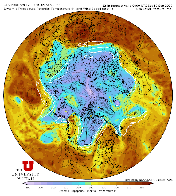
The DT Theta is a hemspheric scale (northern or southern) analysis of the dynamic tropopause potential temperature, wind speeds (showing the jets), and sea level pressure. I've developed this for teaching large-scale dynamical concepts as well. DT Pressure is pretty similar but plots pressure rather than potential temperature (not shown).
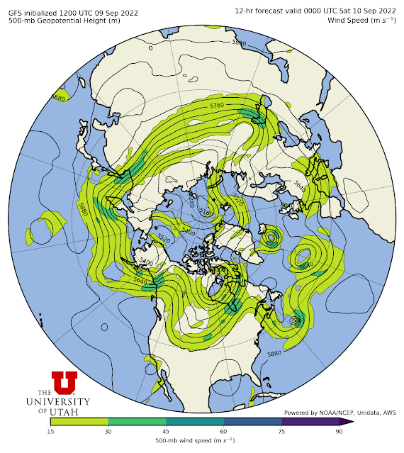
500 hPa HeightsA few things have gone away. I've gotten rid of some regions that I rarely used, the old "convective diagnostic" used for diagnosing thunderstorms and related severe weather, and a couple of oddball products that I wasn't using much. I would like to eventually put together a proper convective diagnostic again, but lack the time at the moment.
I have a few other fish to fry in this area, but it may be a while. The main priority now is to move to "version 2.0" of our Little Cottonwood Forecast Product. That new version will be an improvement over the old in a number of ways. First, it is based on the GFS BUFR data for Alta, so it will be produced much faster and with greater reliability than last winter. Second, many of the variables (e.g., temperature, wind) are based on training with three winters of observations and GFS forecasts, rather than just two. Finally, we are hoping to plop in a new and better snow-to-liquid ratio algorithm. It is that last part that we are still testing and evaluating. Stay tuned.


Love the new graphics/products, nice work!
ReplyDeleteWould it be possible to add a few more Time Heights (BUFR) locations? I would like to see Ogden and Provo added.
ReplyDeleteNot at this time. I need to get some other things done. Maybe in a few weeks.
DeleteThanks, no rush.
Delete