Showing posts with label Observations. Show all posts

Friday, July 12, 2024

Temperature Observations: It's Complicated

Yesterday's maximum at the Salt Lake City International Airport was 106°F, a record for the day and just a degree short of the all-time high (107°F).  The airport measurement site has been much maligned by some as being "jacked" (i.e., too high) or unrepresentative by some.  This is a subject that we've discussed previously in this blog (see What's Up @ KSLC and Records Falling).  What I have noticed in social media is that there is a tendency to assume that the airport site is wrong and the other sites are right.  There is also a tendency to assume that the differences in maximum temperature at the various sites are due to either calibration issues or local siting characteristics.  In reality, there are many many factors that affect maximum (and minimum) temperature readings.  

There are tens of thousands of weather sensors in the United States providing data to the internet.  The MesoWest project at the University of Utah (https://mesowest.utah.edu/), which began as a collaborative endeavor with the National Weather Service in the 1990s, provides access to these observations (there are other sites that do this as well).  On the MesoWest, you can plot the maximum temperatures over the past 24 hours, which I did this morning for the Salt Lake City area.  As you can see in the numbers below, there is incredible variability.  The official airport observing site (KSLC) has the highest maximum (106°F).  It is located just south of the airport on the left-hand side of the map.  Sites near it, however, range from 103 to 105, and just bit to the northeast you can find a 101 and 102 near or at the Rose Park Golf Course.  At the University of Utah, the range is even larger, with stations reporting maximum temperatures as low as 97 and as high as 105 (the 105 is covered).  

Some of these variations are real.  Urban areas involve rich tapestries of land use that affect local temperatures.  The Rose Park Golf Course, for example, is heavily irrigated.  Other areas are concrete and built up.  During one late afternoon last summer, analyses of late afternoon temperature produced by NOAA over Salt Lake City using field measurements and satellite data show the relative coolness of the Rose Park Golf Course compared to areas near the airport or to the east of I-15.  

Source: NOAA/CAPA

But there are other reasons why maximum temperatures vary from site to site.  The reality is that many different types of instruments and processing algorithms are used to measure temperature.  Instruments have varying response times (and accuracies) and differing averaging and reporting intervals are used. This is especially important for a maximum (or minimum) temperature, which can be the result of a relatively brief spike.  

As an example, below is a time series of yesterday's 1-min temperature observations from the University of Utah observing site at the mouth of Red Butte Canyon.  The maximum temperature at this site based on 1-minute averaged temperature observations provided at 1-minute intervals was 105°F.  There were two spikes between 1400 and 1600 MDT when 105°F was reached.


Let's suppose that this station instead reported data hourly.  There are some stations that report hourly averages.  The average temperature for the 1-hour period ending at 1500 MDT was 103.1°F and for the 1-hour period ending at 1600 MDT was 103.3°F.  In this case, MesoWest would have reported a high of 103°F instead of 105°F.

Alternatively, let's suppose that this station reports a 1-min average temperature every hour.  In this case, the 1-min observation at 1500 MDT was 103.3°F and at 1600 MDT was 102.1°F.  This too would have yielded a high of 103°F instead of 105°F.  

Many stations do not report a maximum (or minimum) temperature.  They simply provide temperature observations in discrete intervals.  In this case, the "maximum" temperature is actually the highest reported temperature.  The National Weather Service observing site at the airport, however, does report a maximum temperature every six hours.  This maximum could occur between observation times.   Older reports describing the characteristics of the measurement system (known as ASOS) suggest that these maxima and minima are based on 5-minute averages updated every minute.  If this is still the case, the maximum temperature reported at the airport is based on 5-minute average temperatures calculated every minute.  I am not sure if this is still the case.  

Ultimately, it is important to recognize when comparing maximum or minimum temperatures at observing sites that there is more happening than just instrument siting and calibration.

Monday, June 10, 2024

What's Up with the Snowfall Measurements at Alta Guard?

I was recently asked about the large difference in snowfall this past season reported by Alta Guard and Alta Ski Area and thought I would take this opportunity to talk about why they might differ and some of the challenges of observing new snow amounts.  

The Utah Avalanche Center provides a long record of snowfall at Alta Guard at https://utahavalanchecenter.org/alta-monthly-snowfall.  For this past season (November through April), their spreadsheet reports only 432 inches.

In contrast, for the same period, Alta Ski Area reported 606.5" (see https://www.alta.com/weather..note that I've subtracted 21.5" that fell in October from their seasonal total through April).  I am often asked how can there be such a large difference since they are "right across the street from each other." 

Actually, the observing sites are not right across the street from each other.  The Alta-Guard observing site is located just on the north side of SR-210 just down canyon for Our Lady of the Snows and just above the highway at an elevation of about 8660 feet.  Alta typically uses observations collected by their snow-safety at Alta-Collins, which is located in Collins Gulch at an elevation of 9662 feet.  

Map source: CalTopo

Thus, Alta-Collins is 1000 feet higher than Alta Guard.  Mean annual snowfall in the Wasatch Range increases by about 100 inches per 1000 feet, so we might expect these to differ by roughly that amount, but the differential this past season was 174.5 inches, so that doesn't fully explain the difference.

However, it turns out that there is another snowfall observing site at Alta, and that is the volunteer National Weather Service Cooperative observer.  It is my understanding that these observations are collected at the Alta Town Offices that are just up canyon from Alta Guard, as indicated below. 


For the same November-April reporting period, that site reported 498.7" if snow (this data can be obtained from https://xmacis.rcc-acis.org/ or the National Centers for Environmental Information).  There was one missing day in that record (Dec 20), but the ski area did not report snow on that day, so we will assume the seasonal total is complete.  

The difference between this site and Alta Collins is pretty close to what we would expect with that 100" per 1000 feet guideline, but 66.7" higher than reported by Alta Guard only about 500 feet away.  How can we explain this difference?

Here I can only speculate.  First, I do not currently have access to the UDOT observations from Alta-Guard, so I cannot rule out the possibility that there is some missing data that is not being considered or the possibility that there was an error transcribing to to the Utah Avalanche Center site.  I suspect this is not the case, but I cannot rule it out.  

Second, it could simply be that the characteristics at the Alta-Guard site favor snow densification, so that that snow depth from a given water equivalent would be lower. Such characteristics would include, for example, greater wind and sun exposure (and this is consistent with my understanding of the site characteristics).  I do not have access to the water-equivalent observations of snowfall observations from Alta-Guard, but the Alta-Coop site reported 50.68" of water-equivalent precipitation from October 1 through April 30.  It is possible that some of this fell as rain (mainly in October), but that is very close to the 49.8" of maximum snow water equivalent observed by the Atwater SNOTEL site that is just up the hill from the two sites.  Thus, for the sake of argument, I am going to assume that about 50" of water fell as snow this past season at the two sites.  

If that was the case, the mean water content of snow for the season at Alta-Guard was 11.6%, whereas at the Alta-Coop site it was 10.0%.  Such spatial differences in snow water content are not unusual in storms and skiers are well aware that there can be highly localized variations in snow conditions depending on wind and sun exposure.  In small storms, such a contrast is small and likely not to attract much attention.  In a storm that produces 1" of water, 11.6% water content yields 8.6" of snow, whereas 10% yields 10" of snow.  But over a season, it adds up to a more noticeable contrast.  

There are other factors that could be playing a role in the difference between Alta-Guard and the Alta-Coop site, including the frequency of sampling, which I have no information about. The higher frequency that you sample, or simply taking measurements as soon as the snow stops during a storm, yields a greater snow depth than if you do it a low frequency at specific times.  These are the realities of snowfall measurement.  

But there's more, and this is important if you are comparing seasons or looking at trends.  The measurement techniques and site used by UDOT (and the US Forest Service in the more distant past) have changed many times over the years.  Given the large spatial variability of snowfall and the sensitivity to measurement frequency and practices, this makes seasonal comparisons and trends problematic.  

The bottom line here is that one should expect there to be some differences in snowfall reported by Alta Guard and Alta ski area simply due to the elevation difference between their two sites.  One might also expect differences depending on local conditions at the two locations, or measurement practices.  The difference in snowfall between Alta Guard and the Alta Coop site illustrates this well.  I don't consider any of these observations to be "wrong."  The reality is that a single number for new snow depth is going to depend on exactly where you measure it.  As I like to say, "all observations are bad, but some are useful."

Monday, May 1, 2023

Snowbird SNOTEL Measurement Oddities

Those of you keeping score at home know that through last week, the Snowbird SNOTEL had still not eclipsed the peak snowpack water equivalents reached in the 2005 and 2011 water years.  

However, things changed over the weekend.  

On April 26th, the snowpack water equivalent was 72.3", the highest of this season, but a shade lower than the 75.1" reached on two dates in 2001 and the 74.6" peak in 2005.  However, from April 26th to 30th, the snowpack water equivalent rocketed upwards to 76.2", a new record.  

Source: NRCS

How did this happen?  Certainly not from snowfall, as the last storm was on April 25th and would have been accounted for by the measurement on the 26th.  The 26th was a spectacular day with great skiing in the wake of that storm and on the 27th the site recorded 72.0", just a shade lower than the 26th.  Then from the 27th to the 28th the measurement jumped to 75.2", despite there being no significant precipitation.  The 27th was a very windy day and perhaps the wind deposited snow over the pillow.  However, it went up even further to a peak of 76.2" on April 30.  How could this happen?  

SNOTEL stations measure snowpack water equivalent using a snow pillow with a pressure transducer.  The snowpack weight of the snowpack presses down on the pillow, resulting in pressure reading that can be converted to a water equivalent.  

Source: NRCS

The pillow, however, simply measures pressure.  It doesn't say anything about where that pressure came from.  Increases could be due to snowfall adding weight to the snowpack, but also other factors like wind transport adding to the snowpack over the pillow, or water moving horizontally through the snowpack during melt periods. A strong layer in the snowpack can also result in bridging, with the snow above the bridge not fully contributing to the weight of the snow.  If the bridge weakens, then there can be an increase in measured water equivalent.  

Snowbird isn't the only location showing this behavior.  Lookout Peak jumped 2" from April 26 to April 28 before dropping a bit through today.  That increase, not associated with precipitation, also pushed Lookout Peak to a record snowpack water equivalent.  

Source: NRCS

Those are a couple of the curious measurement oddities evident over the past couple of days and a reminder that SNOTEL time series are not just a reflection of precipitation or melt.  

That said, we can also have a look at stations where the snowpack has ripened (i.e., warmed to the melting point through the entire depth of the snowpack) and net melting are occurring.  A good one is Parleys's Summit.  On April 28th, snowpack water equivalent was 32.9" and in 3 days it has dropped over 5" to 27.7".  The decrease yesterday was 2.2".  Pretty impressive for the last day of April. 

Source: NRCS

With a warm night last night, a decent amount of sunshine, and another day near or above record highs,  expect the impressive snowmelt to continue at Parley's and other areas where the snowpack is ripe.  

Addendum 2 May 2023:

NRCS appears to have done some quality control of the Snowbird data. When I pulled it up this morning, the big increase was reduced and values were below the 2011 water year maximum.  

Source: NRCS

Tuesday, December 13, 2022

Cold Smoke

What an incredible night of low-density snow at Alta.  From the 4 PM board wipe yesterday afternoon to 7 AM this morning they've had 10 inches of snow with .31" of water for an average water content of 3.1%.  There is a tendency for precipitation gauges to undercollect snowfall, but still, this is very much cold smoke. 

Let's take a look at why the snow is so low density.  Two important clues are in the morning upper-air sounding from the Salt Lake City International Airport.  First, the temperatures between about 750 mb (2500 m/8000 ft) and 650 mb (3500 m/11,500 ft) are between -12 and -18˚C.  This is in the heart of the temperature range for growing dendrites, those six-armed snowflakes that we all love and can create low-density snow.  I've identified this region with the green box. 


The second is that the winds in this and the surrounding layers are very light: 15 knots or less.  Thus, Mother Nature isn't bashing these flakes and they are less damaged when and after they reach the ground.  Ridge top winds have picked up some this morning, with ridge-top gusts reaching 30 mph, so there could be some localized wind transport going on, but for the most part, this is fantastically dry snow.  

We can also have a look at the profiling radar system we are operating at Alta this winter.  This radar provides vertical profiles through the storm, so we can create time-height sections like the one below, which are a high-resolution profiles focused on the lowest 900 meters or so above Alta (up to about 3600 m/11,800 ft).  Radar reflectivity in the top panel indicates that echo tops were very shallow, sometimes reaching only 700 m above the instrument.  At other times the max out just beyond the high-resolution range (lower resolution data shows spikes to just over 1000 meters).  Basically, this is a very shallow storm and most of it is in the dendritic growth zone.  

Notice also that the radar reflectivity generally increases toward the ground.  This is consistent with the growth of snowflakes as they are falling, maximizing near the surface.  This is all happening in an incredibly shallow layer.

The middle plot presents the Doppler velocity, which in this case represents the air motion plus the fall speed of the snowflakes.  These velocities are generally weak, and fluctuate from weakly positive to weakly negative, with a bias toward weak negative vertical velocities.  This is consistent with shallow, weak convection in which there are fluctuations from weak ascent to weak descent.  The slight negative bias is a result of the fall speed of the dendrites, which is around 0.5 to 1 meter per second and always toward the ground.  Basically, the storm is like a shallow pot of water on simmer.  

We also have an instrument at Alta that measures the size and vertical velocity of falling particles.  This allows us to get some idea of the composition of the precipitation.  In the plot below, we present a summary of the observations over a 1-hour period ending at 0900 UTC (2 AM MST).  The fall speed of particles varies depending on the composition and size, so we have added lines of what we might expect from pure rain, graupel, and dendrites.  Many of the particles during this period lie near or along the dendrite line, which is what we would expect and consistent with the cold smoke (the spike on the left side of the graph to the lower part of the rain line is an artifact that we haven't quite teased out yet).

There are some variations in what this instrument saw overnight, so if you were to take a close look at the snow crystals, perhaps you would see some very small graupel particles or other ice crystals at times.  Storms are almost always a stew of particles.  

Enjoy the skiing if you are up today.  

Monday, December 12, 2022

Last Night's Delivery and Some New Toys

Last night delivered in spades with Alta-Collins picking up 17" of snow with 1.04" of water (6% mean water content).  The Utah Avalanche Center reports 14–17" of snow in the upper Cottonwoods, 8-10" of snow on the Park City Ridgeline, and 15" of snow in the Ogden area mountains. Good news for everyone.  Total snow depth at Alta-Collins topped out last night at a remarkable 78 inches.  Periods of low-density snow will continue today and add another 2-4" to the totals at Alta.  

Over the past few weeks, members of my research team (Peter Veals, Michael Wasserstein, and Ashley Evans) have been working to install some new toys such as profiling radars and other precipitation measurement systems at Highland High in Sugarhouse and Alta in order to better observed and understand how the Wasatch affect winter storms.  We are especially interested in how storms evolve from the valley to the mountains in northwesterly flow and introducing high-school students to meteorology, so Highland High was a very good location for us to site our equipment.  We're also grateful to UDOT for their assistance.  

Last night the equipment and comms worked flawlessly and we got some great data.  I'll focus here on the radar from Highland High as we got some great data on the transition from rain to snow.  

A profiling radar points vertically through the storm.  Instead of scanning the storm horizontally like many weather radars that you see on TV, it profiles the storm vertically.  One can take these profiles and create a time-height section, like those we create from the forecast models.  In the time-height section below, we are plotting three variables (note that time increases to the right, in contrast to the model time heights we produce): reflectivity (top, roughly a measure of precipitation rate), doppler velocity (resulting from vertical air motions and the fall speed of the snow, graupel, or rain), and spectral width (a measure of turbulence and other factors that cause variability).  


The top plot above shows the pulse-like nature of the precipitation overnight with fluctuations from weak to strong echoes and in the depth of echoes.  The middle plot shows a transition from positive (upward) velocities at upper levels (red) to downward at low levels (blue), consistent with the fallout of snow.  We'll skip spectral width for this post.  

We run the radar in two modes.  The first is a low-resolution deep mode, which is presented above.  The second is a high-resolution shallow mode, covering the red box in the plot above.  This allows us to look in detail of what is happening near the surface.

Below is a plot of the high-resolution data.  In it, I've identified the melt layer, which descends to near the surface from about 0000– 0400 UTC (5–9 PM MST).  Above this layer, the storm is mostly snow.  The radar reflectivities are relatively low (15-20 dBZ) and the doppler velocities are 0.5–1 m/s.  Those velocities are consistent with the fall speed of snow.  

As precipitation falls through the melt layer, the snow turns into rain.  Reflectivities increase to 25–40 dBZ) and fall speeds increase to 7–8 m/s.  This is because wet snow and rain scatter more radar energy back to the radar than dry snow and they also fall faster.  Eventually, we'll work up some code to automatically identify the melt layer for weather monitoring and forecasting purposes (I've identified the melt layer above by eye).  

In the future, we may talk about some of the other observations we are collecting.  We hope to eventually put this data on a public-facing web page.  

Thursday, September 1, 2022

Summer Records at KSLC

Questions about the representativeness of the KSLC observing site notwithstanding, below are the new records for Salt Lake City based on official records from the National Weather Service.  Figures are from https://xmacis.rcc-acis.org/.

1. Highest average maximum temperature, 94.1˚F. 

2. Highest average minimum temperature, 68.8˚F.

3. Highest average temperature, 81.5˚F.


4. Days with a maximum temperature ≥ 100˚F, 27.


5. Days with a minimum temperature ≥ 70˚F, 53.


In an earlier post (A Look at Max Temps @KSLC) we took a look at temperatures at the observing site compared to site on the Bountiful Bench.  At that site, records go back to 1975 and this summer's mean maximum temperature was the 5th highest (86.5˚F, the record is 87.7˚F in 2007), the mean temperature was the third highest (76.0˚F, the record is 76.4˚F in 2021), and the mean minimum temperature was the second highest (65.5˚F, the record is 65.5˚F in 2021).  Let's also look at the top 5s for each of these variables at this site.  Records go back to 1975 and they are complete (i.e., no missing days).  

Minimum Temperature:
2021: 66.0
2022: 65.5
2003: 65.4
2007: 65.0
2012: 64.8

Mean Temperature:
2021: 76.4
2007: 76.3
2022: 76.0
1994: 75.8
2003: 75.7

Maximum Temperature:
2007: 87.7
2006: 87.7
1994: 87.5
2021: 86.8
2022: 86.5

The evidence is quite strong that we are in a different climate today along the Wasatch Front than the one that existed during the 20th century.  In recent years we are seeing higher temperatures, especially  minimum temperatures.  These data above shows this is happening on the valley floor and on the benches.  

More sleuthing is needed to evaluate the impact of station moves and land-surface conditions on trends at KSLC.  Ultimately, this won't change the story much.  We are living in a warming world and a warming urban area.  The summer climate of the 20th century is gone forever.  Fluctuations from summer to summer are occurring around a higher and climbing mean.  

Wednesday, August 24, 2022

A Look at Max Temps @KSLC

As of August 23rd, there have been 25 days with a maximum temperature of 100˚F or higher at the Salt Lake City International Airport.  This is a new record for a calendar year, eclipsing the 21 days of 100˚F or higher observed in 1960, 1994, and 2021.  

Over the years, I have had many people contact me concerning the veracity or representativeness of observations collected at the airport.  It is something that I have written about previously, including in 2013 (see What's Up @KSLC).  

The reality is non-climatic factors related to instrumentation changes and biases, observing techniques, land-surface change, urbanization, irrigation, and in some instances station moves affect trends and extremes at many observing sites.  Some of these are documented, some not. A good deal of processing is done to identify and adjust for these effects to identify climate trends, a process known as climate data homogenization.  

Climate trends are typically derived after this homogenization, but applying such corrections to daily temperatures is more difficult.  For example, biases can vary depending on the weather (e.g., whether or not the wind is blowing, whether it has rained recently, etc.).  Doing such corrections systematically for daily temperature records is very challenging.  

Additionally, any station measurement is collected at a point and any point measurement is specific to that location.  In an urban environment like Salt Lake City, there can be a great deal of variability in temperature, so even under the best of circumstances the representativeness of observations from KSLC has limits.  For instance, golf courses may be cooler due to irrigation.  Heavily treed areas may see lower temperature than the airport.

Here we focus on July temperatures for two reasons.  First, it is the hottest month of the year, so trends during this month are especially important for human comfort, water demand, and energy use.  Second, it is the month with the least year-to-year weather variability in the Salt Lake City area, so trends may be more detectable.  

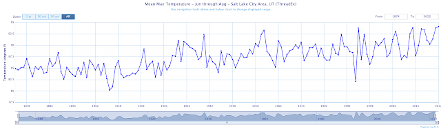
Weather records for Salt Lake City date back to 1874, but this is based on observations collected by the US Weather Bureau/National Weather Service near present day downtown Salt Lake City prior to 1928 and at the Salt Lake City airport (KSLC) thereafter.  This observing-site change is clearly evident if you look at the combined time series from the two sites (I have added a vertical bar in 1928 in the time series below).  There is a shift to higher maximum temperatures and a drop in minimum temperatures around 1928.  

Time series graphic source: http://xmacis.rcc-acis.org/

These changes indicate that in the early 20th century, the airport location observed a larger daily July temperature range than the downtown observing site, with higher maximum temperatures and lower minimum temperatures.  This is consistent with the airport's lower elevation, although by 1920 there was already significant development in the downtown area that may have also contributed to higher minimum temperatures at that site.  Some might hypothesize that airport's proximity to the Great Salt Lake might lead to a smaller daily temperature range, but the time series do not support that hypothesis.  

Another feature evident in the time series above is a trend to higher temperatures later in the record.  Precisely when that trend begins is difficult to determine visually, but for minimum temperature it appears to begin in the 1970s.  For maximum temperature the trend is not as large and may emerge from the background variability a bit later.  

Let's take a closer look at what has been happening since 1975. I pick this date in part for convenience because there is a nearby observing site that has a complete record of July observations since that date, Bountiful Bench (big hat tip to that volunteer observer).  The Bountiful Bench site is about 15 km northeast and 775 feet higher than the airport.  

Below are the July average maximum temperatures and linear trends from 1975 to 2022 at both sites.  Visually, there is remarkable correspondence in the year-to-year variability and long-term trends at the two sites.  KSLC observes higher maximum temperatures due to its lower altitude.  Based on linear trends, maximum temperatures at KSLC have increased almost 1˚F per decade, whereas at Bountiful Bench they have increased about 0.75˚F per decade. 

We can take the difference between these two time series to better identify possible shifts in station characteristics.  There seem to be three periods in this time series.  One prior to about 1996ish when the difference between the two stations fluctuates between 4 and 7˚F, then a period from about 1996ish to 2011ish when the difference is between 3 and 6˚F, and then the period after 2011 when the difference is greater than 5˚F.  

At this point, we don't know why those shifts are occurring.  They could be due to instrumentation changes, shifts in the location of the instruments, or other changes at either observing site.  More sleuthing is needed than I have time for today. 

The change after 2011, however, is quite abrupt and something that we've investigated previously (see The Most Boring Summer Ever? from 2013).  Two things happened around that time.  First, the observing site was moved to its current location.  Below is a Google Earth image of the current observing site location from 2009.  This is pre move.  

By 2010, the observing site (in the center of the triangle) appears to be either installed or in the process of being installed.  I am not sure when it became operational.  

Then, sometime between 2013 and 2015, the area was denuded of vegetation.  The image below is from 2015.

It is possible (maybe likely) that either the instrumentation move or the land-surface changes are contributing to the higher maximum temperatures at KSLC compared to Bountiful Bench. The average increase in this difference after 2011 is about 2.5˚F.  Let's suppose that we were to adjust the daily maximum temperatures by 2 or 3˚F so that 102 or 103˚F was the "new 100˚F".  Based on the counts for this year, that would knock the number of 100˚F days down to something between 3 and 8 based on this year's distribution of observed max temperatures through Aug 23. 

Days ≥ 98˚F: 36
Days ≥ 99˚F: 33
Days ≥ 100˚F: 25
Days ≥ 101˚F: 18
Days ≥ 102˚F: 8
Days ≥ 103˚F: 3

But here's another way to look at it.  First, it is clear from the time series above that July maximum temperatures are increasing at both sites.  It is getting warmer, regardless of any non-climatic effects in the KSLC time series.  

Second, let's assume we "only" reached 98˚F on the days we hit 100 this year and that observations prior to 2011 are "truth" and trustworthy (more on this in a minute).  With such a correction, we would be tied for 6th all time for days ≥ 98˚F through August 24th [years at or above days ≥ 98˚F prior to 2012 are 1940 (25), 1960 (30), 1961 (26), 1994 (32), 2003 (28), and 2007 (30)].  Prior to 1960, 1940 is the only year with more than 19 days ≥ 98˚F.  

Now, let me throw a few caveats into this analysis.  First, we should be cautious viewing Bountiful Bench as "truth."  It too can be affected by site or instrumentation changes.  For example, why does the difference between the stations decline around 1996ish?  Is that due to something at the Bountiful Bench site or KSLC?  Often such changes are not well documented.  Second, we should be cautious about treating past observations as well as "truth" because there are some warts there as well.  Was there anything happening in or around 1960 that might affect the representativeness of those observations, for example.  

At this point, I'm exhausted.  Others will need to do that sleuthing for me.  

Friday, July 22, 2022

Visit to Storm Peak Lab

Storm Peak Lab is a permanent mountain-top research facility located at 3220 m (10,564 ft) near the summit of Steamboat Springs ski area.  The lab has been in existence for more than 40 years, with equipment initially operated from a small trailer and now as a permanent facility.  

Storm Peak Lab

This summer, ownership and operation of the lab transition from the Desert Research Institute to the University of Utah under the direction of Dr. Gannet Hallar, with significant support for the lab coming from the National Science Foundation and other agencies.  Earlier this week, I made my first visit to the lab with a group of undergraduates who are participating in our Research Experience in ALpine Meteorology program (REALM).

REALM students and other visiting scientists and students at Storm Peak Lab

There are remarkably few mountain-top or high-altitude scientific laboratories in the world that collect a comprehensive suite of meteorological, cloud, trace gas, and other observations.  The lab is quite literally packed with instruments, some permanent and some temporary.  These instruments measure a remarkable array of variables including trace-gas concentrations (e.g., carbon dioxide), cloud condensation nuclei, ice nuclei, etc. etc.  Such measurements are critical for understanding air pollution, cloud and precipitation processes, and climate change.  

Gannet Hallar describes the instruments at Storm Peak Lab

The students and I learned, for example, about mercury in the atmosphere, its natural and human sources, and how measurements at the lab are advancing our understanding of its sources and sinks.  

Dr. Lynne Gratz of Colorado College presents her latest work on mercury in the atmosphere

We're excited for Storm Peak Lab to be a University of Utah facility.  It will be a game changer for us, not only for mountain meteorology, but also interdisciplinary mountain studies, education, and outreach.  With support from the National Science Foundation, I am planning on taking a group of graduate students there in the fall as part of my graduate-level mountain meteorology course.  

Monday, July 18, 2022

Records Falling

Yesterday's high at the Salt Lake City International Airport of 107˚F set a record for the calendar day and tied the the all-time high temperature reached previously on 26 July 1960, 13 July 2002, and 15 June 2021.

Nearly all stations reporting to MesoWest at elevations below 5000 feet elevation in the Salt Lake Valley were at or above 100˚F.  Record highs for the calendar day were also set at the City Creek water plant (98˚F), BYU (104˚F), and Tooele (105˚F).  

I fielded a number of question yesterday about why the airport is so warm and whether or not the instrument is properly calibrated.  We have dealt with such questions many times since I started this blog over 10 years ago (for example, see What's Up @KSLC).  Only the National Weather Service can comment on the current calibration of the KSLC instrument.  I'll address here the representativeness (or lack thereof) of the airport observing location.  

Urban and near-urban areas exhibit large spatial variability in temperature.  There is no single representative site at which you can measure temperature in an urban area.  Temperatures will be different in Liberty Park than downtown.  One side of a building is going to have a different temperature than another.  Variations of a few degrees or more are not uncommon.  

Airport observations are representative of airports.  Airports do not have the same building or surface characteristics as downtown cores, suburban areas, highway corridors, or city parks.  

Based on the available observations, it is not unusual for KSLC to observe the highest temperature in the Salt Lake Valley on summer afternoons.  This is especially true when the flow is from the south (as it was yesterday) and the lake breeze and up-valley northwesterly flow that often develops during the day is suppressed.  

One reason for this is the airport is the lowest place in the valley.  Another is that the airport is in an area with limited tree cover and irrigation, especially since the closure of Wingpointe Golf Course.  

Additionally, the site of the National Weather Service station is likely vegetation free.  It was the last time I visited there and was when the satellite imagery used by MesoWest was collected.  Note the observing site below (temperature of 104˚F from yesterday) showing the station in the middle of a denuded field.  

Source: Mesowest

Trends at the airport have also been affected not only by global and regional climate change, but also urbanization along the Wasatch Front and nearby region, airport development, moves of the observing site, and instrumentation changes.  These issues have also come up frequently on this blog.  There is no location in the Salt Lake Valley that would not be affected by changes such as these (the airport development might be unique to that location, but everywhere in the Salt Lake Valley has experienced developmental change).  

So, an all-time record at the airport is just that.  An all-time record based on observations collected by the National Weather Service (or their predecessor the US Weather Bureau) at the airport (or prior to the late 1920s downtown Salt Lake City).

Meanwhile, across the pond, the UK Met Office is still expecting the all-time record high for the UK of 38.7˚C to fall today or tomorrow.  I just tried to pull up some observations from the UK Met Office Weather Observations Website and just got a spinning wheel.  There must be a lot of meteorologists checking out the latest readings ;-).  The UK Met Office has reported that it is likely already the hottest day on record in Wales.


Friday, April 3, 2020

The Power of Data Assimilation

Data assimilation is the process of determining the best initial estimate of the state of the atmosphere, ocean, and land using prior forecasts and observations.  It is an absolutely essential first step in numerical weather prediction since weather forecasting is what scientists would call an initial value problem.

The best data assimilation system in the world is the European Center for Medium Range Weather Forecasting (ECMWF) 4DVAR system.  4DVAR stands for four-dimensional variational assimilation.

4DVAR at ECMWF is an incredible marvel.  According to their web site, ECMWF processes and uses 40 million weather observations daily, most from satellites.  Incredibly, they have a web site where you can actually see the observations going into each forecast cycle.  The slides below summarize everything that went into the 0600 UTC 3 April initialized ECMWF forecast cycle.  You can click to enlarge, although for the purposes of this discussion, the details aren't important.  The slides are mainly to provide a glimpse at the incredible collection and processing of data that occurs 24/7 to produce a global weather forecast.


The video below provides a glimpse at the past, present, and future of the ECMWF 4DVAR system.


An interesting thing about data assimilation is that all observations are not created equal.  Some have a bigger impact than others and in some cases, bringing together multiple observation types gives more bang for the buck than if you added up the impact of each observing type independently. 

We are currently running an inadvertent experiment on the value of aircraft observations, which have declined significantly in the past month due to COVID-19 travel restrictions and reductions.  Below is the trendline for Europe through 24 March.    

Source: https://www.ecmwf.int/en/about/media-centre/news/2020/drop-aircraft-observations-could-have-impact-weather-forecasts
As of 23 March, the ECMWF reported a 65% reduction in European aircraft weather observations and a 42$ global reduction.  

Based on early studies, the ECMWF suggests that removing all aircraft observations from their data assimilation system results in a degradation of short-range temperature and wind forecasts at jet-stream level of 15% and surface pressure forecasts of 3%.  The former illustrates why it is advantageous for aviation companies to provide such observations for weather prediction, since the improvement in forecast skill reduces fuel consumption through better route planning and may also improve passenger comfort through better turbulence forecasts.  

Modern data assimilation truly is an incredible scientific marvel.  Without it, numerical weather prediction would not be possible and any great global forecast system has a great data assimilation system. 

Tuesday, February 12, 2019

Western Austria Snow and Avalanche Information

I've been in Austria for almost a month and thanks to a little help from my friends, especially Lukas Lehner here at the University of Innsbruck, I'm finally beginning to get a handle where to find weather, snow, and avalanche information.  I'm interested in a lot more than the avalanche report, but also mountain snow and weather observations, and there are multiple sources for those. 

In part, the complexity of finding all this information reflects the jurisdiction of European countries and Austrian States.  I will focus today on western Austria, which includes the Tirol and Voralberg. 

Source: WIkipedia
Tirol is the German spelling and I will use that here.  Curiously, the Tirol is divided into two pieces, despite it being one state.  As I understand it, this is an artifact of the World War I armistice, which ceded the Südtirol (South Tirol) immediately south of the Alpine divide to Italy. 

Multilingual avalanche forecasts and information for the Tirol, Südtirol, and Trentino are available at https://avalanche.report

Source: https://avalanche.report
I've found this to be an excellent source of information, and they provide access to high-resolution weather and snow analyses produced for the Tirol by ZAMG, the Austrian Weather Service.  These include analyses of snow height (sometimes called snow depth in the U.S.) and fresh snow.  Below is an analysis for this morning.  The contrast from north to south is apparent with the deepest snowpacks in the mountains north of the Inn Valley including immediately north of Innsbruck and in the Arlberg region in the northwestern part of the analysis.  One can also access observations from some observing sites. 

Source: https://avalanche.report
Further west, avalanche forecasts and information is also available for Voralberg, the westernmost Austrian state, at https://warnung.vorarlberg.at/vtgdb/dist/index.html#//lwd/lagebericht.html.  This site focuses on risks other than avalanches, but does provide access to some snow and weather observations in the region.

Source: https://warnung.vorarlberg.at/vtgdb/dist/index.html#//lwd/lagebericht.html

Those sites are very useful, but other sites provide access to more data or analyses in alternative formats.  ZAMG provides analyses from their INCA model at https://www.zamg.ac.at/incaanalyse/.  This allows one to get a broader perspective on the Austrian Alps and, at least this winter, the remarkable snowpack that exists throughout the northern Alps. 

Source: https://www.zamg.ac.at/incaanalyse/
Snow and weather observations are available from several sites.  I don't know if there is any one site that integrates this information like MesoWest does with weather data in the U.S.  For the Tirol, one option is Hydro Online (maybe start at https://apps.tirol.gv.at/hydro/#/Schneeh%C3%B6he/?station=101501).  An example of a snow height graphic for the season, displayed relative to data from the period of record, is provided below.  This site is in near the German border at 1670 in the Lech Valley.  Snow depths are near the highest in the period of record, although there must have been a huge storm cycle there one year that pushed them to a full 5.5 meters in late February.  Click on the Schneehöhe Jahr tab if you go to the link to see the annual trend. 

Source: https://apps.tirol.gv.at/hydro/#/Schneeh%C3%B6he/?station=101501
Another option is https://www.lawis.at/station/. Below is the seasons observations from the same site presented above.  They provide a very nice interface with detailed topographic maps.  The site is the red dot in the image below, so you can get some perspective on the characteristics of the site.  

Source: https://www.lawis.at/station/
One thing that I've found challenging is that the border between Tirol and Voralberg lies in Arlberg pass and the Arlberg region, which I like to look at because it is one of the snowiest regions in Austria.  As a result, I find myself switching from site to site quite a bit.  

By and large, there is a remarkable amount of data to play with, which is really great given the incredible spatial variability in weather and snow that exists in the Alps.  

Friday, September 30, 2016

Weather Observations on the Salt Flats

The Bonneville Salt Flats, a remarkable geological wonder, in July 2008
The Bonneville Salt Flats are a remarkable geological wonder and well worth a visit and a hike of a nearby mountain.  Most people drive through them at a high rate of speed trying to get to Nevada or California as quickly as possible, but even a quick stop reveals a world completely different than any other you have experienced.

The Bonneville Salt Flats are perhaps best known for land-speed events that take place on the hard salt crust to the northeast of Wendover.  In recent years, however, that salt crust has thinned and degraded, forcing cancellations or restrictions in speed events and sparking controversy concerning management of the salt flats.

Brenda Bowen, a professor of Geology and Geophysics and director of the Global Change and Sustainability Center at the University of Utah, is leading a 3-year study to improve understanding of the Salt Flats and their recent change (see this Scientific American article for more information).  Yesterday, some intrepid members of our MesoWest team installed a weather station on the Salt Flats to help with the effort, and returned with some great photos.


These photos illustrate the highly dynamic nature of the Salt Flats.  It's not uncommon for portions of the salt flats to be covered with water, but thanks to recent storms, the coverage and depth is quite high.

Click here to access weather observations from the station.

Wednesday, February 10, 2016

Above My Pay Grade

Some of you have commented about the large difference between the DAQ sampler at Hawthorne and the observations collected along the Trax line as well as at Neil Armstrong Academy and the University of Utah.

For the most part, these sensors have generated pretty similar results for the first few days of the inversion.  PM2.5 at Hawthorne has risen fairly steadily during the period (with some ups and downs) with a range from midnight on the 9th to midnight on the 10th between about 38 and 54 ug/m3.  PM2.5 at Neil Armstrong Academy (sorry for change of scale) was generally close to Hawthorne through midnight on the 10th, with the range from midnight on the 9th to midnight on the 10th of about 39 to 65 ug/m3.

Source: MesoWest
Source: MesoWest
The divergence begins shortly after midnight on the 10th (last night), with NAA going to much higher values.  Similar, other samplers operated by the University of Utah at the University of Utah and along Trax are also reporting high values compared to Hawthorne.

It is above my pay grade to explain these differences.  I know little about the measurement of PM2.5, other than it is very difficult, or the instruments used, other than the fact that the DAQ and University of Utah samplers are different.  The discrepancy appears to have developed during a period when fog was in the area.  I don't think this is a coincidence, but I lack knowledge of the sensor characteristics and atmospheric chemistry to provide a reasonable hypothesis why.  I'd rather say I don't know than speculate.  

As such, in future posts during this event, I will be referencing both samplers and mentioning the uncertainty at play.  

Note, however, that the lower Hawthorne sampler was in the unhealthy category for several hours today and the 24-h average is now very close to the unhealthy threshold.  Thus, even though there are uncertainty in the measurements, this remains a serious event.

Sunday, February 22, 2015

Limitations of Long-Term Snowfall Records

This snowfall measurement brought to you by The Home Depot
In a season in which we are seeing seeing remarkable snowfalls in the east (a lot of snow) and in the west (not enough), I've been dealing with a number of questions concerning long-term snowfall trends and records.  Answering these questions is sometimes complicated by the warty nature of our long-term climate records.  We have a saying in meteorology that all observations are bad, but some are useful, and this is especially true for snowfall observations, which are probably the worst of the lot.

Here are just a few things that affect snowfall observations:
  1. On what surface was the snow depth measured?
  2. How frequently were observations taken?
  3. Was the measurement taken right after the storm or a couple hours later?
  4. Was the measurement taken right after the precipitation changed to sleet/freezing rain/rain or a couple of hours later?
  5. How hard was the wind blowing?
  6. Was the measurement location sheltered or wind affected?
  7. Was there any tree or building intercept?
  8. Who collected the data?

And, when we compare contemporary observations with those in the past, changes in observing techniques and site characteristics can make a big difference and in some (most) cases, these changes are poorly documented.  In addition, when one goes into the distant past, the measurement techniques can be far removed from what we do today, at least at some locations (e.g., Looking Back and the World 24-Hour Snowfall Record)

Based on the long-term record at the Utah Avalanche Center, we are making a run at the lowest February snowfall at Alta-Guard.  Those observations are collected today by the Utah Department of Transportation, and in the past by USFS Snow Rangers like Monte Atwater (Note: These are not equivalent to the ski area observations which, at least in recent years, have been collected independently).  The previous record is 34 inches in February 1950.  We are still below that, but have some potential to climb closer depending on how things play out the next several days.

Ultimately, comparing the two Februaries is perhaps not an apple to oranges comparison, but a bit of a gala to Braeburn comparison since the details of the snow measurements in February 1950 are probably lost in the sands of time (one of you historians should do some digging).  Assuming we get no more snow, we can probably say with some confidence that February 2015 was worse.  If we do get more snow, and we end up within a few inches of 34, it will be less clear which February is the "winner."