Friday, August 30, 2013

Outlook for the 2013–2014 Ski Season

Carnac the Magnificent, as played by Johnny Carson
Editor's Note: Special thanks to Jeff Massey for his contributions to this post

Will this be a below average, average, or above average snow year in the Wasatch Range?  We're sure you can find someone who will give you an answer.  Here's what the Wasatch Weather Weenies have concluded:


WE HAVE NO IDEA!

The primary modulator of year-to-year precipitation variations over western North America is the El Nino–Southern Oscillation, commonly abbreviated to ENSO.  All indications are that this year will feature neither El Nino conditions (i.e., a warm tropical eastern Pacific) nor La Nina conditions (i.e., a cold tropical eastern Pacific).  In other words, this will likely be a neutral year.

El Nino, La Nina, or neutral, it really doesn't matter.  Although El Nino or La Nina can weight the odds for snowfall relative to average in other parts of the western US, in the Cottonwoods and probably the Wasatch Range as a whole, there simply isn't a strong relationship.  This is also the case in neutral years.  For example, in the plot below, three-month snowfall accumulations at Alta-Guard (obtained from the Utah Avalanche Center web site) are compared to the corresponding three-month Oceanic Nino Index (ONI, obtained from the NOAA/Earth System Research Lab), a measure of the strength of ENSO.  Although there is e a slight slope of the linear trend line, it's pretty minimal and largely meaningless given the scatter in the data.  The bottom line is that there's very little relationship between snowfall and ENSO at Alta.

Three month (NDJ, DJF, JFM, FMA) accumulated snowfall at
Alta–Guard vs. the corresponding ONI (labeled ENSO index).
Courtesy Jeff Massey.
How about a different perspective.  Instead of looking at three-month snowfall, how about we look at the seasonal (November to April) snowfall and categorize that based on the ENSO phase during December–February when El Nino or La Nina tend to be strongest.  We'll plot this up using box-and-whisker plots with the red line indicating the median snowfall (i.e., half of the seasons are above this line and half are below), the top and bottom of the blue box indicate what is known as the interquartile range (i.e., 50% of the seasons lie between the top and bottom of the box), and the whiskers showing the extremes (i.e., 90% of the seasons lie between the whiskers).  Again, the differences here are not very large.  Even for strong La Nina or El Nino years there isn't much difference relative to neutral, although one might be able to argue that there is a greater range of possibilities in a neutral year.  

Seasonal (Nov–Apr) Snowfall vs. DJF ENSO conditions.
Courtesy Jeff Massey.
Now there are other factors that one could consider, such as the phase of something called the Pacific Decadal Oscillation, or PDO.  The PDO is partly a reflection of ENSO, so this is a bit of an incestuous relationship, but even still, the signal in the Wasatch Mountains appears to be too modest that to shift the snowfall odds strongly in any direction for any given year.

So, the bottom line is that your guess is as good as ours as to whether or not we will have a below average, average, or above average snow year.  However, it's important to remember that Alta's average is 500".  A bad year here is better than a good year in many other areas.  As can be inferred from the plot above, you have about a 75% chance of 400" or more at Alta in a neutral winter.  There are few places on the planet that provide those kinds of odds, a midlatitude sun, and high quality snow.

Thursday, August 29, 2013

Yosemite Fires and Salt Lake Heat

I have a busy day today with little time to blog.  Thus, for your entertainment purposes, I provide the time lapse below of the Rim Fire in Yosemite National Park.  Courtesy National Park Service.  At the end, they provide a few clips showing generally clear skies in Yosemite Valley, presumably to encourage visitors and help keep the local economy going.


In addition, a summary of the summer thus far from the Salt Lake City National Weather Service Forecast Office showing where we stand for a number of records.  


Wednesday, August 28, 2013

The Most Boring Summer Ever?

Source: http://www.telegraph.co.uk/travel/travelnews/10208379/Bland-Shire-residents-visit-village-of-Dull.html
Yesterday evening's rain notwithstanding, this has been a boring summer of weather in Salt Lake City and, at least for minimum temperature, possibly the most boring summer in at least the past 50 years.

We already know that this summer has been hot and that we have had very few days with a below average minimum temperature (only one day in July and August has had a below average minimum temperature, see previous post).  But did you also know that the day-to-day fluctuations in minimum temperature have also been much smaller than usual?

To illustrate this, Trevor Alcott sent me the analysis below showing the average (mean) and standard deviation of minimum temperature at the Salt Lake City International Airport during the heart of summer (1 July to 15 August) since 1958.  This year not only has the highest average temperature, but by far the lowest standard deviation.

Source: NCDC/Trevor Alcott
Standard deviation is a statistical measure of variability.  In a year with a high minimum temperature standard deviation, there are larger day-to-day fluctuations.  In a year with a small minimum temperature standard deviation, there are smaller day-to-day fluctuations.  This year's standard deviation of just over 2ºF is incredibly small compared to anything else over the past 50 years or so.  

However, if you look at the graph below, you will notice that before 2011, the lowest standard deviation in any year was about 4ºF.  Since 2011, however, we've seen standard deviations at or well below that level.  

It is my understanding that the observing system at the airport (known as ASOS) was moved about three years ago and I wonder if this could be playing a role in the decline.  This year has been boring, with limited weather variability, but the remarkably low variability in minimum temperature at the Salt Lake Airport might partly reflect characteristics at the new instrument location.  More digging is needed to test this hypothesis.  

Tuesday, August 27, 2013

Still on Track for the Hottest Summer

With three of the past four days featuring highs only in the 80s at the Salt Lake City International Airport, you might wonder if our record setting hot summer might be in jeopardy.  Well, we've lost a bit of ground, but thanks to continued high minimum temperatures, not all that much.

With just five days to go, our average temperature for summer (June, July, and August) sits at 80.8ºF, 1.5ºF warmer than the previous hottest summer (2007).

Source: NCDC
For the next few days, the pattern largely remains the same, with some periods of monsoon clouds and thunderstorms.  I think we will hang on for victory.  One record that we might fall short of is the number of days reaching 100ºF or more.  I believe we sit at 20, whereas the record is 21.  I don't see us pushing 100 the next few days and the latest that the airport has reached 100 is Sep 8, so time is running out.  On the other hand, we've hit 99 as late as Sep 14 and the way this year is going we probably can't rule out a possible 100 until mid Sep.  We'll see if Mother Nature can bring it.

Finally, I remain amazed at how few days we have observed a below average minimum temperature this summer.  Here's a count:

June: 8
July: 0
August: 1 (so far).

That's right, we had a Blutarski ("zero point zero") in July and haven't done much better in August.  We'll have a closer look at what an outlier year this has been for minimum temperature in a future post.

Monday, August 26, 2013

Some Views from Space

Recent satellite imagery has been really fascinating.  We'll start with todays visible satellite loop, which shows: (1) the decaying cyclonic (counter clockwise) circulation of tropical storm Ivo off the coast of Baja, (2) extensive mid and high clouds streaming northward and northeastward into Utah, and the fires of Yosemite.  Apologies for blogger bleaching it out.


The band of clouds (and precipitation) streaming into Utah from Ivo might be called a Predecessor Rain Event or PRE, which often develop ahead of tropical cyclones that are moving into the midlatitudes and can contribute to heavy precipitation and flooding.  

This type of a pattern is, however, a disappointment for Utah storm chasers.  The widespread cloud cover is putting a damper on the daytime surface heating and thusfar has limited thunderstorm development.  This is your classic case of too much of a good thing.  Too much moisture and too much lift.  With a bit of surface heating, things might have been a bit more interesting.  

Also of interest is yesterday's MODIS imagery of the fires around Yosemite.  Note the remarkably thick smoke, which completely obscures the surface in some areas.  There is also a need series of fire plumes emanating from the southern fire front.  I'm not sure if that reflects terrain or perhaps what is known as roll convection in the atmosphere, which often produces cloud streets of that type.  In any event, it sure is interesting.  

Source: NASA

Sunday, August 25, 2013

Southwest Storms

Today's most intense thunderstorms occurred primarily (but not exclusively) over southern Nevada and California where there was a combination of moisture, instability, and strong surface heating.  Although it rained further east, and some strong storms were observed, the widespread cloud cover appeared to limit convective intensity.


Many of the cells in southern Nevada and California were slow moving, resulting in some significant accumulations in some areas.  The products issued today by the National Weather Service Las Vegas Forecast office includes a long list of flash flood warnings, severe thunderstorm warnings, storm reports, etc.  I never know whether or not to trust the radar-derived precipitation totals, but there are some big numbers reaching several inches in a few locations below.  

Source: NWS
The Clark County Regional Flood Control District has a nice web site that provides access to gauge-based precipitation observations and radar overlays.  Sites near the heavy precipitation accumulation area northwest of Vegas show accumulations of as high as 4.06 inches.  
Clark County Regional Flood Control District
That is an impressive storm and, if I am interpreting the tabular data available on the Clark County Regional Flood Control District web site correctly, it has a recurrence interval greater than 100 years (for any given location).  A four inch accumulation is also very close to the average annual rainfall in the area.

Plenty of Action for the Southwest

Monsoon moisture is resident over much of the southwest and with a upper-level trough off the coast of California and the remnants of Tropical Storm Ivo moving northward, the next few days are going to be very very interesting.

The latest GFS forecast below, valid for Sunday, Monday, and Tuesday afternoons, shows the high levels of moisture over the southwest today, with the weakening circulation of Ivo near the west coast of Baja.  The remnants of Ivo then move across SoCal, the Sierra Nevada, and central Nevada.


For today and through late this evening, the National Weather Service has a large portion of the lower and upper Colorado River basins under a flash flood watch.  That's the dark green shading below.

Source: National Weather Service/weather.gov
The forecast discussion from the National Weather Service Forecast Office in Las Vegas pretty much tells the tale for the lower Colorado River Basin.  I've added the bold font.
SHORT TERM...MODELS CONTINUE TO SHOW INCREASED MOISTURE ADVECTION OUT OF THE SOUTH TODAY THROUGH MONDAY WITH PWATS ON AVERAGE NEAR 1.5 INCHES BY MONDAY AFTERNOON...POTENTIALLY 2 INCHES ACROSS THE SOUTHERN EDGE OF THE FORECAST AREA. THE ONLY CHANGE TO THE FORECAST WAS TO DECREASE SHOWER/THUNDERSTORM CHANCES FOR THIS MORNING AS TIMING BEEN PUSHED BACK SLIGHTLY BUT OUTSIDE OF THAT THE INHERITED FORECAST WAS RIGHT ON TARGET. WITH A LARGE PERCENTAGE OF THE AREA STARTING OFF WITH MINIMAL CLOUD COVERAGE TODAY... THUNDERSTORMS MAY START SLIGHTLY SOONER AS WE REACH THE CONVECTIVE TEMPERATURES EARLIER. ONCE WE GET GOING...EXCELLENT DYNAMICS AND PLENTY OF MOISTURE WILL LEAD TO WIDESPREAD RAIN AND EMBEDDED THUNDERSTORMS TODAY. IN ADDITION TO THE INCREASED FLASH FLOOD THREAT...SOME STORMS MAY BE SEVERE AS WE SAW YESTERDAY WITH ENOUGH SHEAR ALOFT AND A WBZ TEMP NEAR 13KFT. MONDAY IS EXPECTED TO HAVE VERY SIMILAR CONDITIONS...OUTSIDE OF THE INFLUENCE OF ANY MCVS LEFT OVER FROM TODAYS ACTIVITY.
The remnants of Ivo are now forecast by the GFS to eventually move into areas where monsoon thunderstorms are less common, including SoCal, the Sierra Nevada, and central Nevada.  

All in all, a very exciting couple of days.  Salt Lake is on the periphery of the most active area during this period, but a threat of thunderstorms remains.  For our viewing pleasure, hopefully we will see some action that misses the burn scar areas.  

Friday, August 23, 2013

Lone Peak Cap Cloud

I'm like a kid in a candy shop today after a 3 month sugar withdrawl.  Check out the video below of the Foehn-like orographic cloud draped over Lone Peak and the Alpine ridge south of Little Cottonwood.  Courtesy John McMillen.

MCV?

As shown in the loops below, a beautiful little vortex (i.e., circulation system) has formed in the St. George area over the past few hours (note that the loops are not time synced).


The system has the look and feel of a mesoscale convective vortex (MCV), a small scale area of cyclonic (counter clockwise rotation in the Northern Hemisphere) rotation that sometimes forms with thunderstorm complexes.  MCVs can be long lived.  We'll see if this one hangs on as it moves northward through Utah.  

Electrifying!

I don't know about you, but I thoroughly enjoyed last night's thunderstorms.  We had a BBQ in the evening and followed by the thunderstorms as they moved across the Oquirrh Mountains and towards Salt Lake City.  

A crowded porch examines the approaching thunderstorms.
Photo: Trevor Alcott
Wasatch Weather Weenies BBQs never disappoint in August.  We're always able to conjure up some action.  Our resident photographer snapped this photo.  Fantastic!

Photo: Trevor Alcott
Classes start here at the University of Utah on Monday.  Readers of this blog who are U of U students might want to consider taking Atmos 1010: Severe and Unusual Weather and learn about storms like the one above.  

Thursday, August 22, 2013

Juicy Air Coming to Southwest

Yeah, it's a dry heat, but that won't be the case on Sunday and Monday in the lower Colorado River Basin.  As shown by the GFS loop below, a major surge of moisture will push into the lower Colorado River Basin ahead of and with the remnants of a tropical cyclone that is currently forming in the tropical eastern Pacific.

GFS sea level pressure (solid contours), 10-m wind, and integrated water vapor (color fill with warm
colors indicating higher values) forecast loop valid 1200 UTC 22 Aug through 0000 UTC 26 Aug 2013.
The water vapor content of the atmosphere is indicated by the color fill in the loop below, with warmer colors indicating higher values.  Note that the initial surge of moisture into the lower Colorado River Basin from the Gulf of California that occurs in response to enhanced south-southeasterly flow associated with a tropical cyclone currently called tropical depression NINE-E (hopefully it gets strong enough to get a better name than that!).

In response to the moisture surge, the latest GFS forecast for the 48-hour period ending at 0000 UTC 27 August (6 PM MDT Monday 26 August) shows a narrow band of heavy accumulated precipitation extending from northern Baja up the Colorado River, and into southern and eastern Utah.  Model generated precipitation exceeds 6 inches in that grey strip just south of the southern tip of Nevada.

Source: twisterdata.com
Model forecasts always look relatively smooth and simple, so ultimately much will depend on the track of the moisture and the triggering and organization of thunderstorms and related precipitation systems.  The devil may be in the details, but in general, Sunday and Monday look extremely active in the lower Colorado River Basin as this juicy air moves into the region.  

It looks like Utah will also get in on the action.  This is not a good time to be going slot canyoneering.  The latest forecasts keep the juiciest air to the southeast of Salt Lake, but we still have a threat of thunderstorms.  We'll see how this all comes together in the coming days.  

Atmospheric Sciences Student Scores Cover


Congratulations to photographer Tobias MacPhee and University of Utah Atmospheric Sciences Graduate Student Carolyn Stwertka for scoring the cover of the 2014 Backcountry Magazine Gear Guide.  Story available here.  Now that's what I call storm chasing Utah style.

Wednesday, August 21, 2013

Potential Slug O' Moisture

It has been a remarkably boring stretch of weather this summer.  We've had the occasional monsoon surge and a few good rounds of thunderstorms, but nothing to really draw my interest.  That could change later this coming weekend.  The computer models are calling for a tropical cyclone to form off the west coast of Mexico later this week, with its attendant tropical moisture forecast to surge northward into the southwest U.S. and Utah during the weekend and early next week.  The loop below, which shows the GFS forecast valid from 1800 UTC (1200 MDT) Friday through 0000 UTC Tuesday (1800 MDT Monday), pretty much tells the tale. 


Critical to this forecast is the interplay between the upper-level trough moving onto the west coast and the tropical cyclone remnants moving northward into the Southwest.  The tango between these two features will determine whether or not the surge comes into Utah, as forecast above, or alternatively misses us to the west or the east.  It will also affect the timing.  Time will tell if it all comes together.

Although it's professional exciting to see a pattern like this setting up, the potential for gully washers and severe weather will be high (by Utah standards).  Flash flooding could be a concern, as well as debris flows in recent fire scarred areas.  This is a pattern that bears watching over the coming days.

Finally, we don't normally waste our time with matters east of the Continental Divide, but this is such a fascinating case that I can't contain myself.  As the tropical cyclone sweeps northward, generating precipitation over the western United States, it contributes to the development of a very strong ridge downstream over the central United States, as shown in the long-range GFS dynamic tropopause (jet-stream level) forecast valid 1800 UTC (1200 MDT) Wednesday 28 August.


Note in particular the monstrous ridge over the central US.  This is a classic case of what is known as anticyclonic wave breaking, and surfers out there may recognize the "tube-like" nature of the color-fill pattern above.  Should this pattern setup, it's going to be a hot end of August for much of the midwest.  

Tuesday, August 20, 2013

What's Up @ KSLC?

Through yesterday, the average temperature for June, July, and August at the Salt Lake City Airport (KSLC) was 81.2ºF, nearly 2ºF higher than the hottest summer on record, 2007, when the June–August average temperature was 79.3ºF.
Source: http://xmacis.rcc-acis.org
While there is little doubt that this has been a hot summer, many of my meteorological friends have wondered if there is something odd about the temperatures at the Salt Lake City airport, which seem unusually high.  For example, at Tooele, which also has a very long temperature record, 2013 is hot, but not as anomalous as it is at the airport.
Source: http://xmacis.rcc-acis.org
In addition, a comparison of the temperatures at KSLC (top graph below) with those measured by a weather station less than a mile away (bottom graph below) shows that KSLC is consistently about 2ºF higher.

Source: MesoWest
What gives?  I personally find it difficult to draw conclusions from comparisons between surface stations in areas of complex topographic and land-surface contrasts.  For example, perhaps the extreme nature of the temperatures at KSLC reflects the lack of water in Farmington Bay (the southeast "corner" of the Great Salt Lake), whereas Tooele is still getting a lake influence from the main Gunnison Bay.  Perhaps the station less than a mile from KSLC is biased or the difference in temperature simply reflects a contrast in site characteristics.

So here's a different way to address the problem (special thanks to Trevor Alcott for providing these figures).  Compare the temperatures measured at KSLC with those measured by weather balloons at 700 mb (approximately 10,000 feet above sea level).  During the summer, there's usually a strong correspondence between these measurements, so what we are looking for is a shift in that correspondence.

Observations for the past two summers (2012 and 2013, red stars and lines below) show that maximum temperatures for a given 700-mb temperature were slightly warmer than during the 1960–2011 period.  The difference, however, is less than 1ºF, and might not survive the usual significance tests, which I haven't bothered conducting.  Let's just say the change is small.
Comparison of daily maximum temperature and 0000 UTC 700-mb temperatures at the
Salt Lake City airport (KSLC) during 1960–2011 (blue) and 2012–2013 (red).  Courtesy
Trevor Alcott.
When we look at minimum temperature, however, we see a much larger difference, with minimum temperatures for a given 700-mb temperature clearly warmer in the past two years.
Comparison of daily minimum temperature and 1200 UTC 700-mb temperatures at the
Salt Lake City airport (KSLC) during 1960–2011 (blue) and 2012–2013 (red).  Courtesy
Trevor Alcott.
Now, we should be cautious about assuming this phenomenon occurred in the past two years.  Our choice of 2012–2013 is purely arbitrary, and perhaps with a bit more analysis we would find that this is a trend that has emerged over many years.  I leave that work for others.

Why this change has occurred?  Potential contributors have been discussed in prior posts (see Intricacies of Local Temparture Trends Part I and Part II) and include Global Warming, Urbanization, changes in the land surface at the airport and the adjoining area, and instrumentation changes or biases. In addition, the meteorology in the past two years may have simply favored higher minimum temperatures (e.g., more wind, high clouds, etc.). Finally, we haven't adjusted at all for instrument bias, and that could play a role.  For example, the NWS has changed instruments for measuring upper-air temperatures many times over the years.

It should also be noted that KSLC is typically one of the coldest places in the Salt Lake Valley in the morning.  Thus, there is more potential for large trends and variations in minimum temperature at KSLC than on the benches.  For example, the difference in minimum temperature between nights with clear and cloudy skies is larger at KSLC than at bench locations.  This is an important consideration when doing comparisons with other climate stations.

In conclusion, this has been a hot summer.  The analysis above supports this fact, but also illustrates the unique nature of observations at KSLC where it appears at least minimum and possibly maximum temperature have been somewhat anomalous for at least the past two summers (possibly longer) relative to long-term relationships with 700-mb temperature.  Further work is needed, however, to ascertain if this is a recent shift or a long term trend and to explain its causes.  The bait has been dangled.  Get to work!

Monday, August 19, 2013

Tidbits

The endless persistence of ridging over the Intermountain West has finally led to writer's block, so here are some items that caught my attention the past few days.
  • Climate Change: Count me amongst those who are skeptical that carbon capture and sequestration (CCS) will every work effectively on the massive scale needed to reduce greenhouse gas emissions.  Some reasons why are discussed by Tom Zeller Jr. in an article posted today in the Huffington Post.  The article also contains a great quote by Gavin Schmidt about carbon dioxide levels recently reaching 400 ppm: "We are a society that has inadvertently chosen the double-black diamond run without having to learn first.  It will be a bumpy ride." I wish I'd thought of that one.
  • Chemtrails: I used to get calls a couple of times a year from people asking about chemtrails, which conspiracy theorists believe are trails left by aircraft that are laced with chemical or biological agents.  There are of course good explanations for contrails, which are produced by aircraft, including their longevity and occasionally strange characteristics.  Learn more in this blog post by Cliff Mass.  
  • Don't sweat the small stuff: Humans have a long history of worrying about the wrong things.  The latest: Bear attacks.  The threat posed by these invading menaces has finally been exposed  by CNN.  Yup, this is serious stuff.  From 1900–2009, 63 people were killed in bear incidents in the the contiguous US, Alaska, and Canada.  63!  Thank goodness they didn't include numbers from Hawaii and Mexico as that would be really scary.  I don't want to belittle the importance of taking proper precautions when in bear country, but really.  We have plenty of other things to be worried about.    


Back from the Dead


Our model serving website weather.utah.edu has returned from the dead.  It was actually back early last week, but I've made a number of changes and additions since then that should be of interest for do-it-yourself forecasters:

  • I've retired the old 40-km NAM grid and replaced it with a full product suite from the 12-km NAM grid, which is as close as you can get to the native NAM output.
  • I've increased the number of products available from the GFS, NAM-12km, and NAM-4km (a high resolution nest embedded in the 12-km NAM), including four panels, soundings, and time-height sections for the Great Lakes region.  Why the Great Lakes?  We're doing a field program there this winter.  Tug Hill skiers and snowmobilers should be pleased!  Wasatch skiers will still find soundings and time-height sections for Alta.  These often arrive later than the other plots.  
I'm hoping to replace the current sounding and time-height section plots with higher vertical resolution versions in the coming months.  I've had this on the to do list for many years, but just haven't gotten around to it.  

As usual, comments and suggestions appreciated. Our crack team of customer service agents awaits your call.  

Saturday, August 17, 2013

99 Stinks!

We mentioned yesterday in the previous post that clouds and smoke might make it tough to hit 100 and, although I though we might eke it out, we only hit 99.  What a waste!  99 is the worst temperature psychologically.  It's hot, but 100 sounds so much hotter and it has triple digit bragging rights.  On the cold side, there's really no equivalent, Whether it's 1, 0 or -1, it all sounds damn cold.  Fahrenheit temperatures are bogus for scientists, but there's really nothing on the celsius scale like 100.  40ºC?  Please.  That's really hot (104ºF) but it clearly lacks the cachet of 100.

Further, 100 yesterday would have tied the record for days of 100 or more in a summer.  The wait continues....

Friday, August 16, 2013

One Down, One to Go

Yesterdays 100ºF high at the Salt Lake City airport was day 20 of 100 or more this summer.  We now sit just one day shy of tying the record, set in 1960 and 1994.

It will be interesting to see if we can reach it today.  If skies were clear, I'd say it was in the bag.  The 700-mb temperature yesterday morning was 15.2ºC and yesterday afternoon was 15.6ºC.  This morning's was even higher at 16.2ºC.  Thus, today's airmass is even warmer than yesterday's.

The problem is that there's more smoke over the airport today, as well as a few clouds.  This might be worth a degree of cooling.  Yesterday we were in the clear, but areas to the west like the Skull Valley and Northern Stansbury Mountains were in a thick pall of smoke, as shown by yesterday's MODIS image below.  

Source: NASA
Today, some smoke has drifted over the Salt Lake Valley.  So far (through 1 PM), however, temperatures are in line with yesterday's.  I think we will eke out 100, but it's going to be close.

Thursday, August 15, 2013

Run at the 100 Club

Forecast highs for today and tomorrow are 100ºF at the Salt Lake City International Airport.  If we can meet or exceed 100 both days, we will reach 21 days of 100 or more this summer, which would tie the all time record.  Let's hope it happens.  Little point in suffering without attaining some sort of prestige.

We are just about half way through August and remain well ahead of any previous year for the mean summertime temperature at the Salt Lake City Airport.

Source: http://xmacis.rcc-acis.org

Wednesday, August 14, 2013

Wildfire Videos and Photos

Fire is on the landscape of northern Utah.  The Rockport 5 fire sparked yesterday quickly grew into a beast that destroyed 13 homes.  

Wildfire behavior is strongly influenced by three components summarized in the Fire Triangle below: Fuels, Topography, and Weather.

Source: Southwest Environmental Research & Education
Here's a video of the a wildfire that started on Monday afternoon in the Avenues and was quickly put out by heroic fire fighters.  It pretty much shows all three of these components in action.  In particular, note how the flame front movement and intensity increase near the end of the video as the wind (i.e., weather) pushes the flame front into fresh grass (i.e., fuels).   Movement of the flame front down the hill (i.e., topography) probably resulted in a slower fire spread than if the flame front was moving uphill.  Video courtesy of John McMillen.


There are some remarkable photos of the Rockport 5 fire on the Salt Lake Tribune web site.  The one below is from Tribune Photography Steve Griffin, who has taken many remarkable weather related photos over the years.
Source: Steve Griffin/Salt Lake Tribune
The processes responsible for producing these whirls are similar to those that generate dust devils.  Strong surface heating, which can be quite intense during a fire, generates an updraft that stretches and concentrates rotation in the atmosphere in much the same way that an ice skater that stretches their body begins to spin faster.  The initial source of rotation can be vertical wind shear near the earth's surface, which gets tilted and stretched in the vertical by the updraft.  In the case of the Rockport 5 fire, horizontal wind shear generated by flow interaction with topography could have played a role.  Fire whirls are believed capable of producing winds comparable to those found in EF0 or EF1 tornadoes (EF here standing for the Enhanced Fujita Scale for Tornado Damage).

Tuesday, August 13, 2013

The View from Above

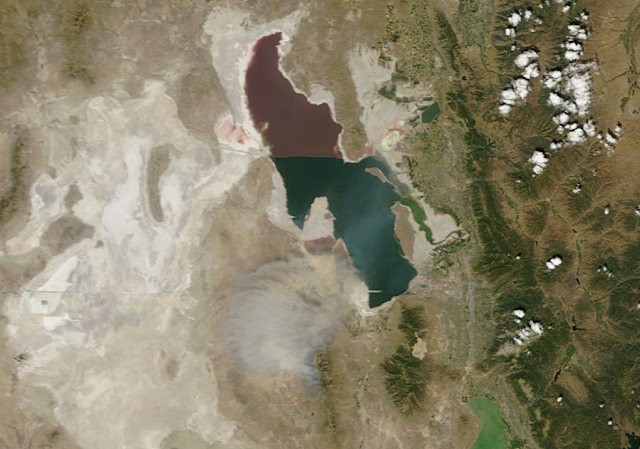
The images provided by the Moderate Resolution Imaging Spectrometer (MODIS) aboard NASA's Terra and Aqua satellites are always spectacular and frequently provide some great perspectives on atmospheric, land, and lake processes over northern Utah.  

Yesterday's Aqua overpass below tells us quite a bit about the Great Salt Lake.  Note it's limited area, with just a thin sliver of water in Farmington Bay east of Antelope Island and no water at all in most of the Bear River Bay, with the exception of diked and reservoir areas like Willard Bay.  Extensive grey areas, indicative of playa, surround the Great Salt Lake and are consistent with it's low elevation.  You can also see a large evaporative pond just to the east of Stansbury Island and the contrast in color between the northern and southern half of the lake, which is divided by an earth railroad causeway that runs westward from Promontory Point.  With the lake at a relatively low level historically, it is surrounded by extensive grey playa, that helps to illustrate the area of the lake at high-water stands.  

Source: NASA
Also of interest is smoke from the Patch Springs Fire, which extends northward from the western base of the Stansbury Mountains to over the southern Great Salt Lake, comingling with cumulus clouds over  the Tooele Valley.   It has burned over 6,000 acres, with the fire perimeter outlined below.

Source: www.utahfireinfo.gov

Monday, August 12, 2013

S--t Happens

Here at the U, we run the ragged edge on just about everything.  I wish it wasn't that way, but it is a cold reality and a budgetary necessity.

Those of you who use weather.utah.edu are probably wondering what happened to it.  Well, it's been stored on antiquated equipment for some time and it finally crapped out last week when I was out of town.  I've been procrastinating for months (er, years) moving it to newer hardware and it finally caught up to me.

The good news is that it appears we have a very recent backup, so we will hopefully be back online in the near future.

Patch Springs Fire Optics

The Patch Springs Fire in the Skull Valley west of Salt Lake City put in a great optics display last night, creating a red hue in much of the sky and a blood red sun.


The reddish hue is the result of a phenomenon known as Raleigh scattering, the scattering of light by particles that are much smaller than the wavelength of the light.  As you might recall from high school physics, Roy G. Biv (Red, Orange, Yellow, Green, Blue, Indigo, and Violet) describes the visible spectrum arranged in the order of decreasing wavelength.  Colors with shorter wavelengths at the end of the Roy G. Biv spectrum are scattered more by smoke than those with longer wavelengths at the beginning of the spectrum.  Thus, more of the longer, redder wavelengths of light survive transit through the smoke, leading to the reddish hue and the blood red sun.

As the sun set, we observed the shadow of the smoke move up the Wasatch Mountains, especially near Mount Olympus.  This shadow had a distinct red tint.  In particular, in the lower image below, contrast the color of the rock on upper Mt. Olympus with that of Thunder Mountain and Lone Peak in the right of the photo which were not in the shadow. 


Friday, August 9, 2013

Western Snow Trends and Global Warming: Part II

I've been on the road attending the American Meteorological Society Conference on Mesoscale Meteorology, so I missed yesterdays exciting weather and haven't been thinking much about climate change.  Nevertheless, I owe a post on this subject.

In our previous post, we discussed a recent study by Pierce and Cayan (2013) in which they examined the uneven response of several snow measures to climate change.  These measures included:
  • SWE: The amount of water in the snowpack on 1 April
  • SWE/P: The fraction of cold-season (1 October - 31 March) precipitation P that remains in the snowpack on 1 April.  
  • Snowfall (SFE): The total cold-season snowfall measured as the amount of water in the snow (abbreviated as snowfall water equivalent, SFE).
  • SFE/P: Fraction of total water in the cold-season precipitation that falls as snow
Their analysis suggested that long-term trends in these snow measures will emerge at different points in the future as the climate warms over the western U.S.  They suggested that increases in temperature and decreases in the fraction of precipitation that falls as snow would emerge first (as they have), with declines the fraction of cold-season precipitation that remains in the snowpack on 1 April and the amount of water in the snowpack on 1 April emerging later.  Amongst the snow variables examined, trends in snowfall will be the hardest to detect and emerge the latest.

Their results are based on downscaled climate model projections.  Because projections of climate require a vast amount of computer power, they typically are done at low resolution.  These models divide the atmosphere into cells that are perhaps 50 or 100 miles on a side, which is far to coarse to resolve the effects of the mountains of the western US.  Downscaling means that you take that coarse climate model projections and you use either statistical or regional modeling systems to generate a higher resolution projection.  In the Pierce and Cayan (2013), this downscaling effort involved the use of a hydrologic modeling system known as VIC, which allowed them to examine changes in snowpack.

Here we examine some of the regional contrasts in snow measure trends, with regions defined based on the color coding below.  Note that the Wasatch region spans a wide range of snow climates including the Tetons, Wind Rivers, Bear River Range, Uinta Mountains, Wasatch Mountains, and the plateaus and ranges of southern Utah.

Source: Pierce and Cayan (2013)
The figure below summarizes how the snow climate in each of 8 western US regions changes during the 21st century according to the average of the downscaled climate models (note that this averages out the year-to-year variations, revealing the long term trend.  It is based on a "moderate growth" emissions scenario in which equivalent CO2 concentrations reach about 800 ppm (we are at 400 ppm today) and breaks the total cool-season (Oct-Mar) precipitation down into three categories:
  • Rain: Precipitation that fall as rain
  • Melts: Precipitation that falls as snow, but melts and is not retained in the snowpack on 1 April
  • SWE: Precipitation that falls as snow and is retained in the snowpack on 1 April.
Over the Washington Cascades, which feature a temperature-sensitive snow climate, there is an increase in the fraction of precipitation that falls as rain (grey region), an increase in the fraction of precipitation that falls as snow but melts before 1 April (pink region), and a decrease in the amount of snow retained in the snowpack on 1 April (blue region).   On a region-wide basis, the decline in the latter is about 35%.  Note that this is an average for the entire region, so there will be variations with elevation.  

Multi-model average of the fate of precipitation within eight regions over the western United States
during the 21st century.  Rain indicates the amount of cool-season precipitation that falls as
rain, melts indicates the amount of cool-season precipitation that falls as snow but melts before
1 April, and SWE indicates the amount of cool-season precipitation that falls as snow but
remains in the snowpack on 1 April.  Source: Pierce and Cayan (2013).  
On the other hand, in the colder Wasatch region, these changes are not as dramatic.   There is some increase in the fraction of precipitation that falls as rain and the fraction of snow that melts before 1 April, but the total decline in snowpack is about 22%, smaller than found in the other regions except the Colorado Rockies.

So, barring a shift in storm track not anticipated by these models, the snow climate of the Wasatch region and the Colorado Rockies have some "insurance" against global warming.  This is especially true at upper elevations.  It also means that trends in snow measures like 1 April snowpack SWE will take longer to emerge than found in warmer snow climates to the west.  These results are, of course, based on downscaled climate model projections and they are very dependent on the rate of warming and the quality of precipitation projections produced by those models.  Ultimately, what happens will depend on how high greenhouse gas concentrations go, how sensitive the climate system is to those concentrations, and whether or not there is a more dramatic shift in the storm track than anticipated by the climate models over the western U.S.

Tuesday, August 6, 2013

Western Snow Trends and Global Warming: Part I

Source: American Meteorological Society
David Pierce and Dan Cayan of the Scripps Institution of Oceanography recently published an interesting paper in the Journal of Climate entitled The Uneven Response of Different Snow Measures to Human-Induced Climate Warming.  The paper has important implications for the detection of climate change and the future of skiing over the western United States.

Their findings are based on an analysis of climate change as represented by 13 downscaled climate models driven by two greenhouse gas and aerosol emissions scenarios known as RCP4.5 and RCP8.5.  They are considered medium and high "growth" scenarios with CO2-equivalent concentrations reaching about 800 ppm and 1300 ppm, respectively, by 2100.  We currently sit just over 400 ppm (CO2-equivalent combines the global warming potential of CO2, methane, and other human generated greenhouse gas into a single number for convenience).  In this post, we will concentrate on their cumulative results for the western US, which are based on downscaled model data for the colored grid boxes below.  

Source: Pierce and Cayan (2013)
What makes the study unique, as suggested by the title, is their analysis of the "uneven" response of different snow measures to human-induced climate warming.  This aspect of the study is important because it has implications for: (1) the detection of climate change and (2) planning by snow-sensitive groups.  These snow measures include:
  • SWE: The amount of water in the snowpack on 1 April
  • SWE/P: The fraction of cold-season (1 October - 31 March) precipitation P that remains in the snowpack on 1 April.  
  • Snowfall (SFE): The total cold-season snowfall measured as the amount of water in the snow (abbreviated as snowfall water equivalent, SFE).
  • SFE/P: Fraction of total water in the cold-season precipitation that falls as snow
Downscaled model trends in these and other climate variables are presented below relative to the 1976–2005 climatology for the high growth (RCP8.5) scenario (results are similar for RCP4.5, but the change is smaller).  

Changes in snow-related and other climate variables over the western U.S. Source: Pierce and Cayan (2013)
The graphs above show the uneven response noted by the authors.  First, note that the relative size of the average change (black line) projected by the 13 downscaled models differs depending on what variable you examine.  For instance, there is a larger relative decline in the average fraction of precipitation that is retained in the snowpack on 1 April (SWE/P) than in the fraction of precipitation that falls as snow (SFE/P).  This makes some sense since warming would not only result in a decrease in the fraction of precipitation as snow, but more melting (and sublimation) of that snow once it is on the ground, so that the change in SWE/P is greater than SFE/P.  

Second, the size of the average change relative to the range of projections produced by the 13 downscaled models (the spaghetti of lines of various colors) is also uneven.  For instance, there is a wider range of "spaghetti" for the average fraction of precipitation that is retained in the snowpack on 1 April (SWE/P) than for the fraction of precipitation that falls as snow (SFE/P).  This means that there is more year-to-year variability in SWE/P (relative to it's typical size) than there is for SFE/P.  Again, this makes some sense since SWE/P is affected by changes in the fraction of precipitation that falls as snow and changes in the frequency and intensity of melting events.  Thus the swings in SWE/P are larger from warm to cold years than for SFE/P.

So, think of the black line as the signal or long-term trend produced by global warming and the spaghetti as the noise or year-to-year variations produced by climate variability.  For any given variable presented above, the long-term trend due to global warming will take longer to emerge if the variability (i.e. spaghetti) is large compared to the trend (black line).  A good example of this is cold-season precipitation which for the western US as a whole has a large year-to-year variability compared to the small long-term trend.  Identifying a the small trend in precipitation given all the ups-and-downs from year to year is very difficult, although it should be noted that the analysis above is for the western US as a whole and it could be that a regional signal might be more detectable (e.g., a wetter Northwest and a drier Southwest).

The variables for which the long-term trend due to global warming emerges the earliest are temperature and the fraction of precipitation that falls as snow (SFE/P).  The trend in SFE/P is not large (in a relative sense) compared to some variables, but the variability is smaller, and that makes the trend more significant and detectable.  Then comes the fraction of cold-season precipitation retained in the snowpack on 1 April (SWE/P) followed by 1 April SWE.  

Thus, we shouldn't expect all these climate and snow variables to display "smoking gun" characteristics at the same time.  Trends in some variables will emerge later than others.  Temperature and the fraction of cold-season precipitation falling as snow will be the first to exhibit changes large enough to discern from the year-to-year ups and downs in the climate system.  Indeed, there have been several studies showing significant rends in these to variables in recent decades.  Then comes the 1 April snowpack variables, followed lastly by snowfall. 

This analysis is for the western US as a whole and as Pierce and Cayan (2013) discuss, there are important variations with region and elevation (i.e., for a given climate or snow variable, the smoking gun will emerge earlier in some regions and elevations and later in others).  The veracity of the analysis is also dependent on the models providing a reasonable projection of future climate change.  We will have a closer look at the regional variations and their implications in a future post.

Monday, August 5, 2013

The Bleak Remnants of Winter 2012/13

The past two winters provided below average and were followed by hot summers, with this June–July being the hottest in the history of Salt Lake City.  In both cases, the snowpack was decimated during summer, leaving few options for the turns all year types.  This year, the carnage looks even more complete than last year.  Note in the photos below how the patch that lingered at the base of the American Fork Twin last year is gone (the comparison below might be a bit unfair given that last year's photo is about a week earlier, but I fortuitously had it on my hard disk).

AF Twin from Snowbird Tram on 26 July 2012.
Source: Snowbird
AF Twin from Snowbird Tram on 4 Aug 2013.
Source: Snowbird
With some effort, you can find just a few remaining patches along the Alpine Ridge west of Snowbird (click for full res).


Last year, the Timp snowfield was nearly wiped out.  We may need to put it on a death watch this year, although I suspect a patch or two may survive.  Send me a recent photo if you have one.